How TestInspector Tests Responsive Design and Viewport Behavior: Screen Size Assertions, Mobile Layout Validation, and Breakpoint Testing Without Code
Why Responsive Design Testing Fails Without Explicit Viewport Assertions
When you run a UI test at desktop resolution only, you are testing roughly 35% of your user base and skipping the rest. Mobile and tablet sessions account for the majority of web traffic in most markets, and the layout your mobile users see is a different rendering pipeline — different CSS rules, different grid columns, different font sizes, different element stacking order.
The specific failure mode is predictable: a component that works correctly at 1440px viewport width hides an overflow, collapses a navigation menu, or reorders flex children in a way that makes it unusable at 375px. That failure is invisible to any test suite that runs only at desktop. It is visible to every mobile user who tries to use the broken component in production.
TestInspector addresses this directly. Rather than writing separate test scripts for each viewport, you configure a single test to execute across a defined set of viewport sizes — mobile (375x812), tablet (768x1024), and desktop (1440x900) are common baselines. Each viewport run is treated as an independent execution context. Screenshots are captured, baselines are established, and deviations are flagged without writing any code.
How TestInspector Validates Responsive Layout With SSIM Screenshot Comparison
TestInspector's visual regression uses Structural Similarity Index (SSIM) to compare screenshots against approved baselines. SSIM is more accurate than pixel-diff approaches for responsive layouts because it evaluates structural patterns — edges, contrast regions, element boundaries — rather than exact pixel values. A layout shift that moves a button 3 pixels produces a high SSIM score if the button is still in the same relative position. A layout collapse that moves the button to a different row produces a low SSIM score even if the absolute pixel change is modest.
When you first run a viewport test in TestInspector, it generates baseline screenshots for each configured viewport. You review and approve these baselines in the TestInspector interface. On every subsequent run — triggered manually, on a schedule, or via the CI/CD trigger API — TestInspector compares the live render against the approved baseline and reports any SSIM score below your configured threshold as a visual regression.
| Viewport | Common Breakpoint | Layout Changes to Validate | TestInspector Approach |
|---|---|---|---|
| Mobile | 375px | Hamburger menu, stacked columns, touch targets | SSIM baseline at 375x812 |
| Tablet | 768px | Two-column grid, expanded nav, hybrid touch | SSIM baseline at 768x1024 |
| Desktop | 1440px | Full nav, multi-column layouts, hover states | SSIM baseline at 1440x900 |
TestInspector also supports exclusion selectors — you can mark specific regions of the viewport screenshot (a dynamic ad slot, a rotating testimonial, a live-updating counter) as excluded from SSIM comparison. This prevents irrelevant dynamic content from triggering false positives while still validating the structural layout around it.
Setting Up Mobile and Breakpoint Tests in TestInspector Without Code
The workflow for configuring viewport-specific tests in TestInspector starts in the browser interface. You navigate to the page you want to test, select "Add step," and choose the visual regression action. TestInspector prompts you to configure the viewport size for this step — you enter the width and height, or select from a preset (Mobile, Tablet, Desktop). After saving, TestInspector captures the initial screenshot at that viewport and presents it for baseline approval.
For a full responsive test suite, you add one visual regression step per viewport to the same test sequence. A complete three-viewport test might look like this:
- Step 1 — Navigate: Open the page URL.
- Step 2 — Visual assertion at 375px: Capture and compare mobile layout.
- Step 3 — Visual assertion at 768px: Capture and compare tablet layout.
- Step 4 — Visual assertion at 1440px: Capture and compare desktop layout.
- Step 5 — DOM assertion: Confirm that the navigation hamburger element is present at 375px and absent at 1440px.
The DOM assertion in Step 5 is an important complement to the visual comparison. SSIM tells you that the layout changed structurally. A DOM assertion tells you whether a specific functional element (the hamburger menu toggle, the mobile CTA button, the sticky header) is present and accessible at the target viewport. These two assertion types together give you both visual and structural confidence.
TestInspector's self-healing selector logic handles the common case where a component's DOM selector changes between deployments. If the hamburger menu's class name changes in a framework update, TestInspector flags the change and suggests the updated selector rather than failing silently or passing incorrectly.
Once configured, the test runs on the schedule you define — nightly, on each deployment, or on a manual trigger. TestInspector's CI/CD trigger API lets you fire responsive tests from your deployment pipeline so that every push to production validates all three viewports before the deployment completes.
For teams building mobile-first applications, the test automation services at Astaqc include responsive design test setup and baseline approval workflows tailored to your component library and deployment cadence.
Common Responsive Design Bugs That Viewport Testing Catches in Practice
Responsive design bugs fall into predictable categories. The following are the most common issues that teams find when they add explicit viewport assertions to their test suites for the first time.
Overflow Without Scroll
A component with a fixed width renders correctly at 1440px but overflows its container at 375px, creating horizontal scroll or clipped content. SSIM catches this immediately because the structural layout of the page changes: elements that should be centered appear partially off-screen. DOM assertions confirm the overflow by checking computed element width against the viewport width.
Touch Target Size Violations
WCAG 2.5.5 requires touch targets of at least 44x44 CSS pixels. A button that is 36px tall at desktop resizes to 28px at mobile because the base CSS does not include a media query override. Visual regression catches this as a layout change. An explicit size assertion catches it as a measurement violation. TestInspector supports both: SSIM for the visual change and axe-core accessibility assertions for the WCAG measurement.
Navigation Menu State Errors
The desktop navigation renders correctly. At mobile viewport, the hamburger icon is present but the menu does not close after a navigation link is clicked. This is a state bug that SSIM does not catch on its own (because the closed menu looks correct). A TestInspector interaction sequence — open menu, click a link, assert menu is closed — catches it explicitly as a behavioral regression.
Font Size Scaling Failures
A heading that is 48px at desktop renders at 48px at mobile because the developer forgot to add the mobile media query. The page looks fine structurally (SSIM score is high) but the text is too large for the viewport, causing line wrapping that pushes content below the fold. TestInspector's visual comparison catches this as a layout regression because the element boundaries change — the heading wraps to two lines where the baseline showed one line.
Image Aspect Ratio Breaks
A hero image uses object-fit: cover at desktop. At mobile, the container height constraint is not set, causing the image to stretch to its intrinsic aspect ratio and push subsequent content far down the page. SSIM detects this as a major structural deviation. The fix is a one-line CSS addition, but without a mobile viewport test, the bug lives in production until a user reports it.
The consistent pattern across all these bugs: they are invisible to desktop-only test suites and obvious to any team running viewport assertions. See our complete guide to software testing for context on where responsive design testing fits in a broader quality strategy.
Integrating TestInspector Viewport Tests Into Your CI/CD Pipeline
TestInspector's CI/CD trigger API lets you fire test runs programmatically — from a GitHub Actions step, a GitLab CI job, or any deployment pipeline that can make an HTTP request. For responsive design tests, the standard integration pattern is:
- Deploy the build to staging.
- Send a POST request to TestInspector's trigger endpoint with your test suite ID and the staging environment URL.
- Poll the run status endpoint until the run completes (typically 30–120 seconds for a three-viewport test).
- Read the result — a pass/fail verdict with SSIM scores and screenshots for each viewport step.
- Gate the deployment — if any viewport shows a regression below your SSIM threshold, fail the pipeline step and block the production deploy.
This pattern treats responsive layout correctness as a first-class quality gate alongside unit tests, integration tests, and performance benchmarks. Teams that implement this integration stop discovering mobile layout regressions from production user reports and start discovering them in the deployment pipeline — which is the right place to find them.
TestInspector also supports scheduling viewport tests independently of CI/CD. A nightly run against your production URL validates that no layout regressions have been introduced by third-party script updates, CDN cache behavior changes, or A/B testing platform modifications — changes that happen to your production site without going through your deployment pipeline.
TestInspector's no-code testing platform supports any browser and viewport size that Selenium covers — Chrome, Firefox, Edge, and Safari. The same visual regression capabilities that catch desktop layout regressions apply identically at mobile and tablet viewports.
For teams that need to validate responsive design across a wider range of devices — specific iPhone models, Android screen densities, or non-standard enterprise browser configurations — the manual testing services at Astaqc complement TestInspector's automated coverage with structured exploratory testing across real device profiles.
Frequently Asked Questions
Does TestInspector support custom viewport sizes beyond mobile and desktop presets?
Yes. TestInspector allows you to enter any viewport width and height for a visual assertion step. Teams testing against specific device breakpoints (320px for older Android phones, 428px for iPhone Pro Max, 1920px for wide monitors) configure those exact dimensions in the step settings. Each custom viewport generates its own baseline and runs independently, with its own pass/fail verdict.
How does SSIM threshold tuning work in practice?
SSIM scores range from 0 (completely different) to 1.0 (identical). For responsive layout testing, most teams start with a threshold of 0.95 — meaning any SSIM score below 0.95 triggers a visual regression alert. High-change pages (dashboards with live data, pages with animations) may need a lower threshold (0.85–0.90) combined with exclusion selectors on the dynamic regions. Static marketing pages can use 0.98 or higher. TestInspector lets you set the threshold per step, so a live-data dashboard and a static FAQ page can have different sensitivity on the same test run.
Can TestInspector test responsive behavior for components inside a component library, not just full pages?
Yes. TestInspector can navigate to any URL — including component library Storybook instances, design system documentation pages, or isolated component playgrounds — and run viewport assertions against them. Teams that maintain a Storybook instance use TestInspector to run baseline SSIM comparisons against individual component stories at multiple viewport sizes. This catches component-level responsive regressions before they propagate to the pages that use those components.
What is the difference between visual regression testing and DOM assertion testing for responsive design?
Visual regression (SSIM) catches structural layout changes by comparing rendered screenshots. It detects layout shifts, overflow issues, and element reordering. DOM assertion testing checks specific element properties — presence, computed size, CSS class — in the live DOM. The two are complementary: SSIM tells you something looks different; DOM assertions tell you what specifically changed and whether it violates a defined requirement. Use both in a complete responsive test suite.
How do I handle pages that change frequently without triggering false positives in responsive tests?
TestInspector's exclusion selectors let you mark regions of the screenshot — a news feed, a rotating banner, a live chat widget — as excluded from SSIM comparison. The excluded region is replaced with a neutral fill color before the comparison runs. The layout around the exclusion is still validated; only the excluded region's content is ignored. For high-change pages, combine exclusion selectors with explicit DOM assertions on the structural elements (header height, navigation item count, footer link presence) to maintain meaningful coverage without false positives.
How does TestInspector's self-healing help with responsive design tests after a component refactor?
When a component refactor changes selector names or DOM structure, TestInspector detects that an existing selector no longer matches any element and uses AI-powered analysis to suggest the updated selector based on the element's visual position and surrounding context. For responsive tests, this means a team that renames a component class during a CSS refactor does not lose their entire mobile test baseline — TestInspector suggests the updated selectors for review and approval rather than failing the entire test run. This reduces the maintenance cost of responsive test suites during active development periods.
Responsive Design Testing Visual Summary
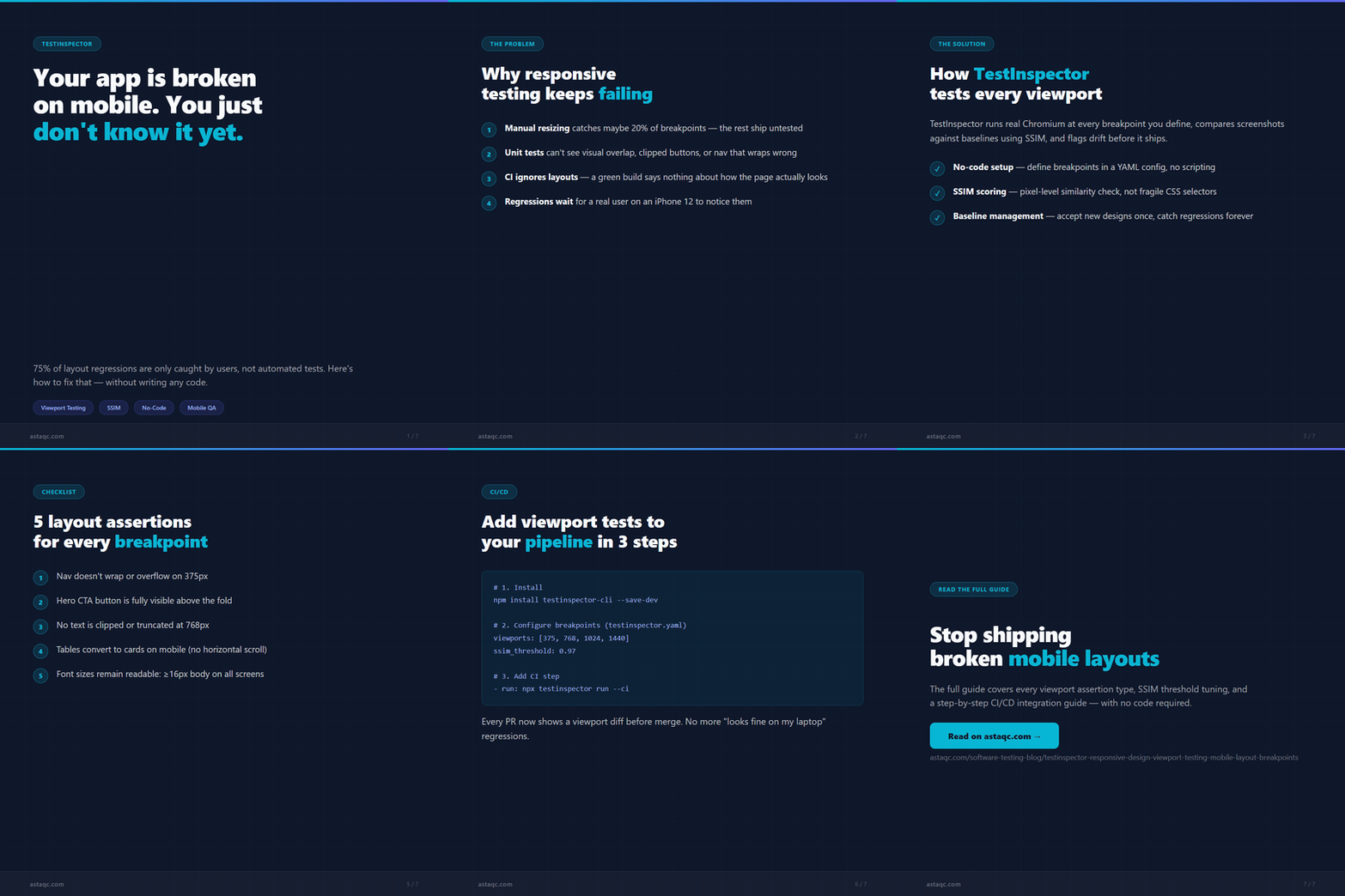
A responsive design test that only runs at one viewport is a screenshot, not a test suite — it misses the two-thirds of your users who see a different layout.

Astaqc Team
November 16, 2026


Published by the Astaqc engineering team. Astaqc Consulting is a software testing company based in India, delivering test automation, manual testing, and performance testing services.